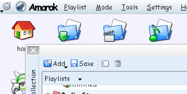
I use the desktop menubar all the time. Mainly because it saves some vertical pixels on every window, very useful on my widescreen laptop. I looks cleaner to.
For those of you that don't know what it is. The desktop menubar shows the menu of the focused application (instead of in the top of the applications main window). It's a feature borrowed from MacOS.
unfortunately unlike in apple's OS the menubar doesn't contain the name of the application the menu belongs to. That creates some confusion for those not used to it and sometimes irritates me.
I suggest that in KDE4, instead of the usual "File" menu (or in amarok 1.4-svn "Engage") be changed to the applications name when using a desktop menubar. Actually, isn't File a bad place to put the quit item? Settings would fit better in there to. KDElibs4 should just rename the first menu to the application-name or just add a icon in front of it like in the screenshot. I guess a lot more people will start using the menubar then.

2 comments:
I would like that very much, since I am using the desktop menubar as well :-)
In addition to the space saving, there is a significant usability reason for using this option (I learned this from a machead who is currently studying HCI):
Since you can click a menu entry even when you are at the very top of the screen, the size of this entry expands virtually above the screens top edge. This way you do not have to aim as precisely in vertical direction for positioning, you only have to aim horizontally + the menu always is located at the same position, so you automatically tend to move into the right position.
Yes, I would like that very much aswell. I use the desktop menubar aswell, though I never owned a Mac, I just found it way better a few weeks ago. The only thing I miss is the application name in there.
Post a Comment